What Are Primary and Secondary Colors?
Color is a critical part of our everyday world. If you’ve ever watched an old TV show in black and white, then you know how drab and dull everything would look and feel without the vibrance of color. Colors help us express our personalities, promote specific moods, decorate spaces and simply add a ton of good, old-fashioned visual appeal. On a deeper level, color is even a useful tool in some types of therapy.
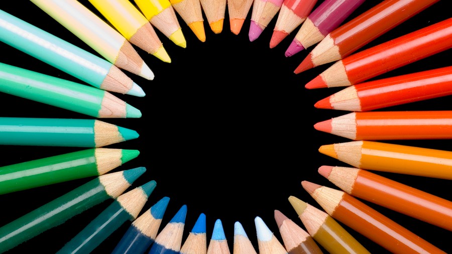
Color theory involves the science behind mixing and combining colors to create specific effects, and the cornerstone of color theory is the color wheel. The concept of a circular color wheel was first developed by Sir Isaac Newton in the 1600s — yes, the same genius who developed the laws of gravity. The design of the wheel is pretty genius itself, with all the colors positioned so that the colors directly across from each other complement each other. These colors are typically referred to as complementary or harmonious. All the individual colors on the wheel are divided into three main categories: primary, secondary and tertiary colors.
Identifying Primary and Secondary Colors
Primary colors — red, blue and yellow — exist independently and can’t be formed from mixing two other colors together. A simple color wheel typically displays 12 colors, with the primary colors located at equidistant spots around the wheel.
Secondary colors — orange, green and violet — are each formed by mixing two primary colors together. Mixing red and yellow produces orange, mixing red and blue produces violet and mixing yellow and blue produces green. On the color wheel, secondary colors are also positioned at equidistant points from each other on the color wheel, positioned between the two colors used to make them — orange between red and yellow, violet between red and blue, and green between yellow and blue.
Understanding Tertiary Colors
A complete traditional color wheel also includes colors known as tertiary colors. These are the colors formed by mixing a primary color with an adjacent secondary color. The combinations are easy to figure out, thanks to the names given to the tertiary colors: red-orange, yellow-orange, yellow-green, blue-green, blue-violet and red-violet.

Some more complex color wheels have up to 24 colors with additional color combinations known as intermediate colors. Other wheels may also have internal circles that provide greater color detail. Keep in mind that a computer displays 16.8 million colors, and there are an infinite number of colors in the world, which means color theory isn’t limited to the color wheel and its typical representation of primary, secondary and tertiary colors.
The Soothing Effect of Neutrals
In addition to bright colors like blue, red, violet and yellow, there are neutral shades and hues that don’t quite fit on the traditional color wheel. When these colors are used by themselves in designs, the overall effect tends to have a soothing, calm feel. Neutral colors are also frequently used to complement primary, secondary and tertiary colors in designs and presentations.
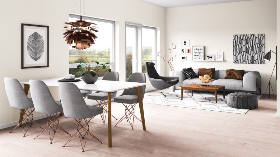
Neutral colors include shades of black, white, gray, tan and brown. The color temperature for neutral colors can fall on either the warm or the cool side, an important distinction when you’re trying to create a look and feel for a room or make a specific statement with an outfit.
Working with Warm and Cool Tones
If you’re looking at a traditional color wheel, you’ll notice that warm tones are traditionally on the right, while cooler tones are traditionally on the left. The color directly across from a color is considered complementary, even though the two colors may seem like sharp contrasts to each other. This is partly due to the visual appeal of balancing warm and cool colors from different sides of the wheel. You wouldn’t want to decorate a room entirely in bright orange and red, for example. You would want to mix in some cooler tones like green or blue to keep the room from feeling overbearing. Cool and warm neutrals are also well suited to helping create balance.

Cool tone colors include green, blue, violet and the different variations of these colors. They are more subdued than warmer tones and can create a visual effect that makes things seem farther away than they really are. Warmer tone colors include shades of red, orange, yellow and the different variations of these colors. Warm tones have a tendency to make objects seem closer to the viewer than they really are.


