What Color Is Produced When You Mix Purple and Orange?
According to Crayola, an art supplies manufacturer best known for its crayons, “purple and orange create a color known as burnt sienna when mixed together.” The company suggests that burnt sienna is a mud-like color with a brown hue.
Purple Mixed With Orange
Purple and orange are both secondary colors. Purple is made of red and blue, and orange is made of red and yellow. Orange and purple mixed together creates a blend of all three primary colors (red, yellow, and blue), though there will be more red present than any other color. Mixing the three primary colors together always makes brown. Since mixing purple and orange together involves so much red, it creates a warm brown hue. Many call this color, which is bright brown with red tones, burnt sienna.
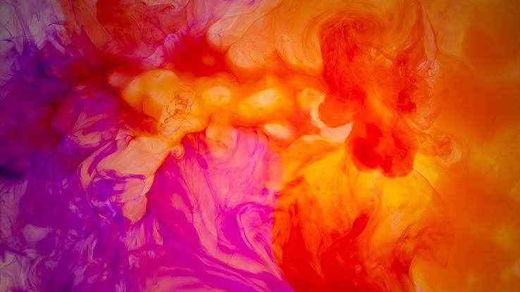
Depending on the mixture of orange and purple, burnt sienna can even take on a pinker, almost mauve tone. The proportions of purple and orange can be changed to come up with a brown color that is either much darker and cooler or much warmer and brighter. Either way, the brown will have an overwhelming red or brassy look because both orange and purple are made of red. Essentially, there is no way to mix the two colors without having a large proportion of red.
By definition, purple comes from a mixture of equal parts red and blue, and orange comes from a mixture of equal parts red and yellow. In reality, there is far more variation among each color. Purples with more red than blue in their mixture are brighter colors like magenta or fuchsia, while a purple mixture that contains more blue creates a much darker color, such as indigo. Orange that has a heavier concentration of yellow can be a much brighter color. This yellow-orange color can be seen on number two pencils and certain types of macaroni and cheese. On the other hand, orange can also be a much darker color with more red than yellow. In this case, the deep red-orange color can be much closer to scarlet than a typical orange.
Just as there is much room for variety among the colors purple and orange themselves, there is also ample room for variety among the mixture of the two colors. The brown one creates can be very bright and brassy with a lot of red in it, but it might also be a darker color due to the presence of more blue. It’s important to note, of course, that a heavier concentration of orange will generally create a lighter brown, while a heavier concentration of purple will generally create a darker color.
The combination of orange and purple can also be changed slightly by mixing white, black, or gray into the mixture. This will give the brown color more opacity, making it either clearer or muddier.
Purple and Orange Color Scheme
As we established above, purple and orange are both secondary colors — colors created from mixing two primary colors. Green, created from mixing yellow and blue, is the third secondary color.

Purple and orange make a warm brown color that pairs well with green since they’re all based in secondary colors. The brown created from orange and purple being mixed together can be very dark, almost black, if more of a dark bluish-purple is used in the mixture. This creates a great visually pleasing contrast with brighter greens that are heavier on the yellow spectrum and more muted minty greens that are mixed with white or pale gray.
All warm colors complement purple and orange since both of these colors are rooted in red. Hence, the range of browns that comes from orange and purple mixed together pair well with warm oranges, reds, and yellows. Brown and gold make a great color combination. A deep brassy brown paired with a bright red or even a bright red-orange are complementary.
Contrasting Colors
To understand contrasting colors, it’s important to first understand color theory. Color theory helps artists, designers, and everyday people pair colors together. Additionally, color theory can help folks understand how to create other shades and colors.
Much of color theory is reflected in the color wheel. The color wheel is based on the primary colors — red, yellow, and blue. Those colors are placed on the wheel in a triangular shape with red at the top, yellow on the bottom left, and blue at the bottom right. (Some color wheels are placed with a different primary color at the top.) So, what makes a primary color? Well, red, blue, and yellow are the primary colors because all other colors come from mixtures of them.
Meanwhile, orange, green, and purple are the secondary colors because they come directly from equal mixtures of two primary colors. So, how are these secondary colors placed on a color wheel? Since red and blue mixed together create purple, so purple lies in between red and blue on the color wheel. Red and yellow mixed together make orange, so orange lies between red and yellow. Finally, green sits between blue and yellow.
The color wheel also helps display contrasting colors — that is, colors that pair well. Any color that is directly across the wheel from another color is considered a contrasting color. So, yellow is the contrasting color for purple, and blue is the contrasting color for orange. While these colors look great next to one another, mixing two contrasting colors together creates brown.
Tertiary colors, also known as intermediate colors, come from mixing a primary and secondary color together. Rather than using equal mixtures, tertiary colors come from including more of one color than another. For example, yellow-green is a tertiary color that, as the name indicates, includes much more yellow than green.
Primary colors pair well together, while secondary colors are also viewed as a matching color scheme. The same logic applies to tertiary colors. That said, the color wheel can be used to decide which contrasting shade pairs best with the particular shade of purple or orange you’re working with. It can even be used to find complementary colors for something like burnt sienna. That said, knowing how colors relate to each other, and which ones pair well together, is important for design, whether you’re working on an interior design project or a graphic design assignment.

